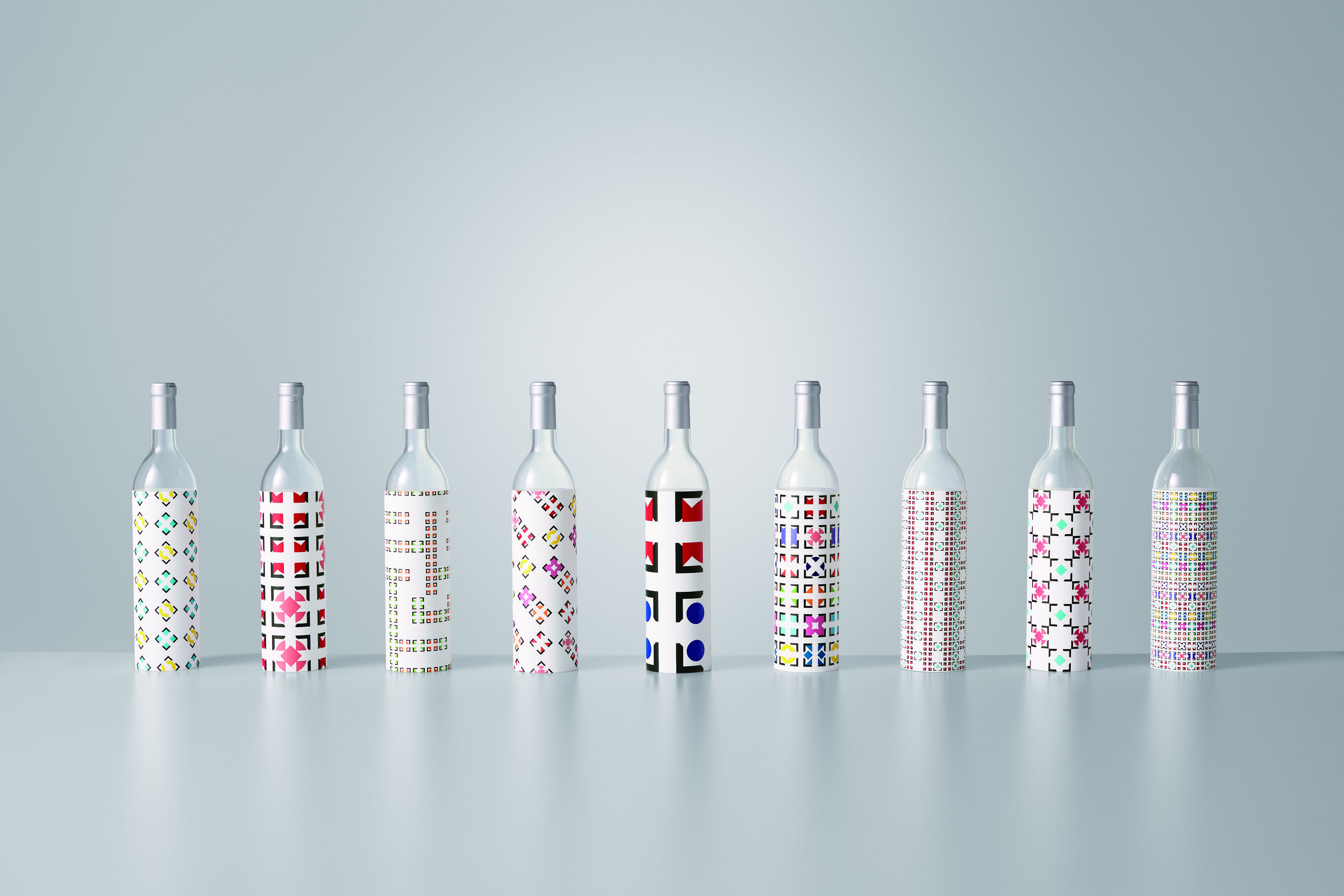
Sake crests

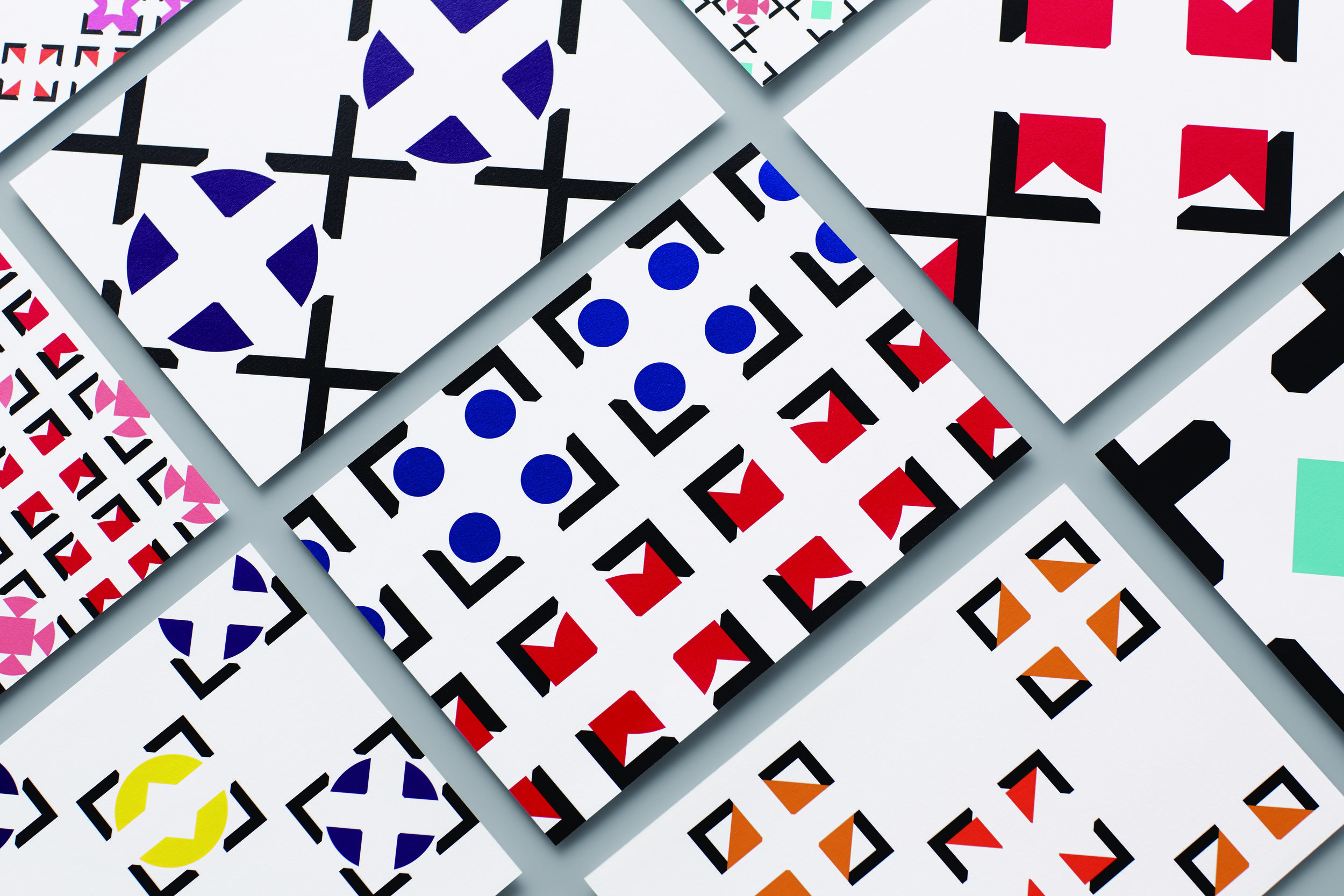
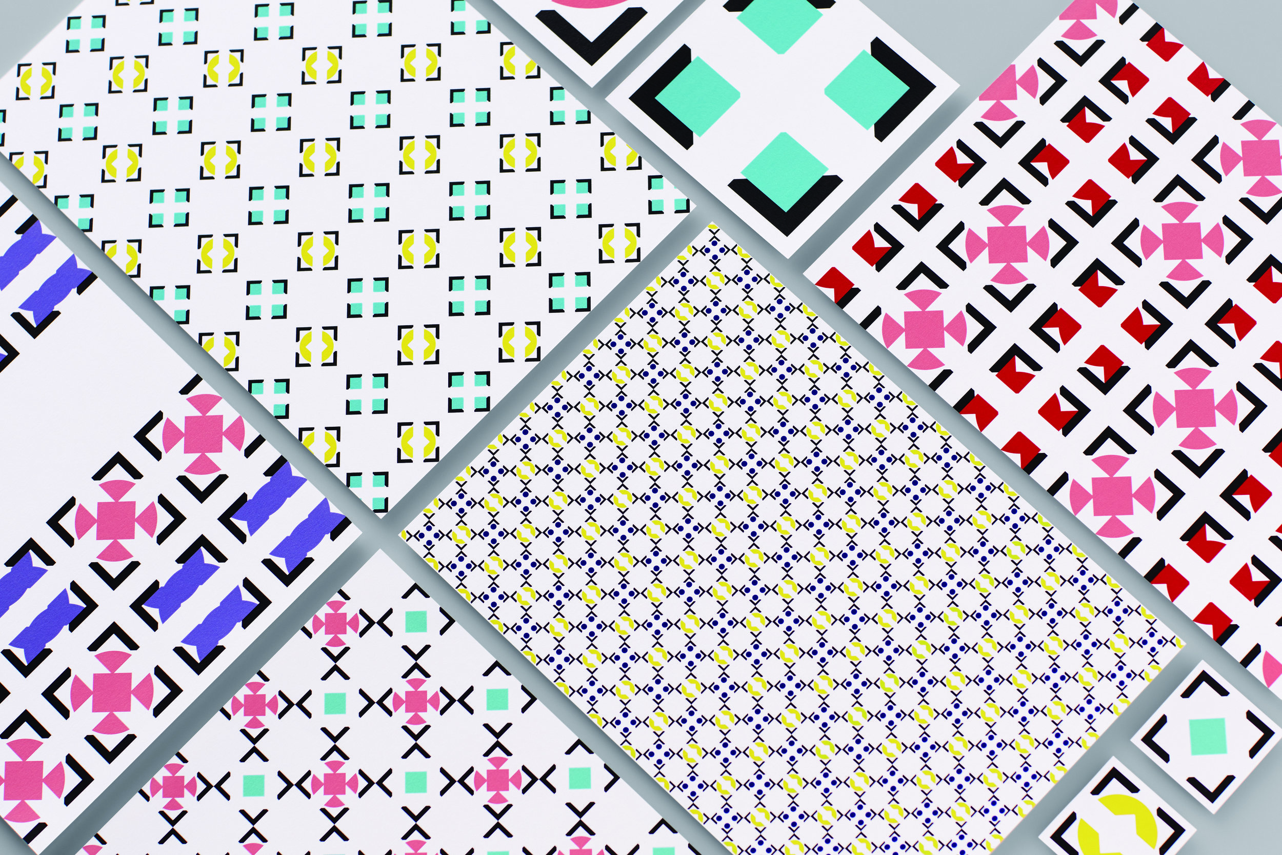
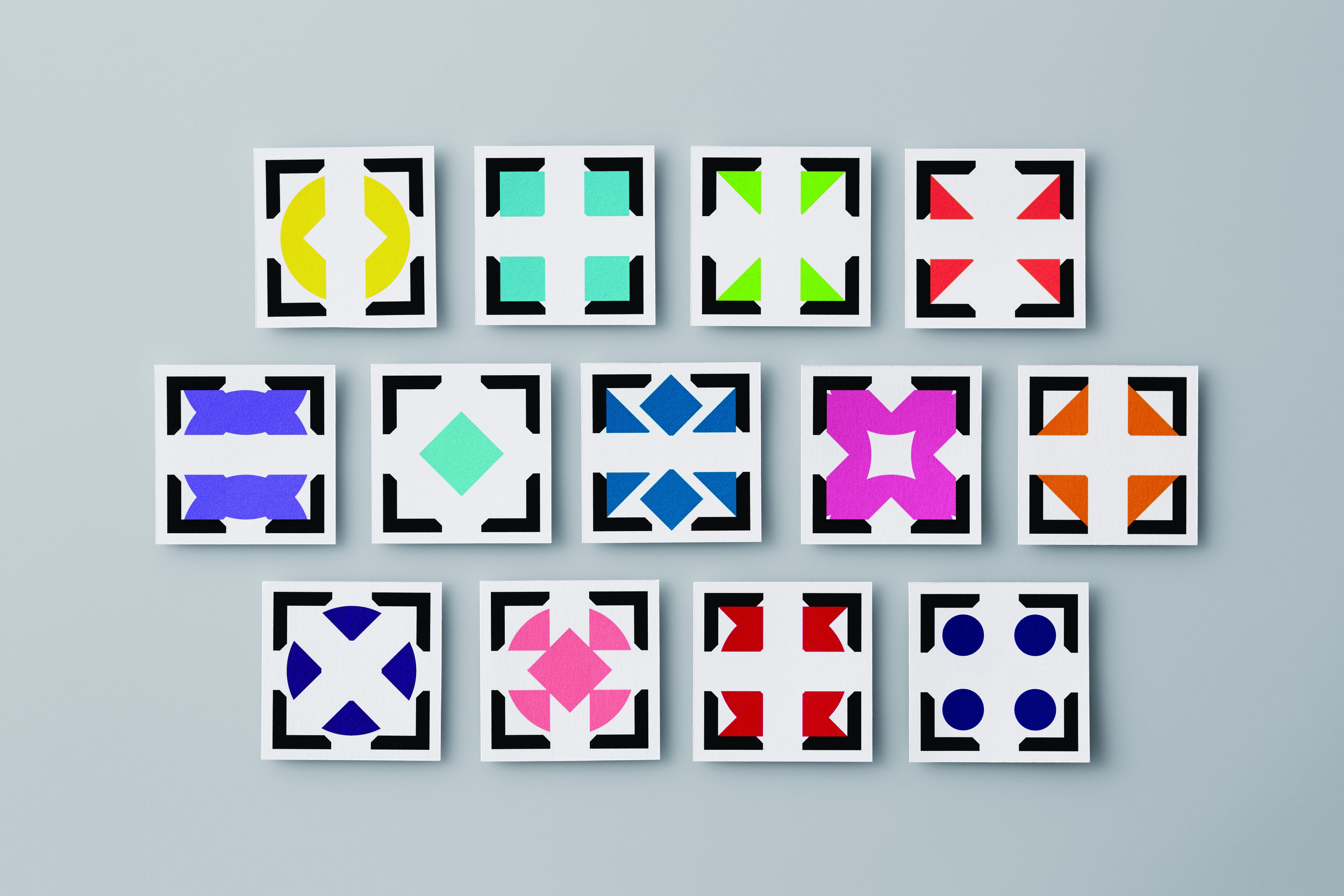
The Sake Crests/KURAYA.INC
My role in this project was being the art director and designer, responsible for making visuals and choosing print technique.
KURAYA.INC held a big sake-tasting event in Tokyo in 2015.
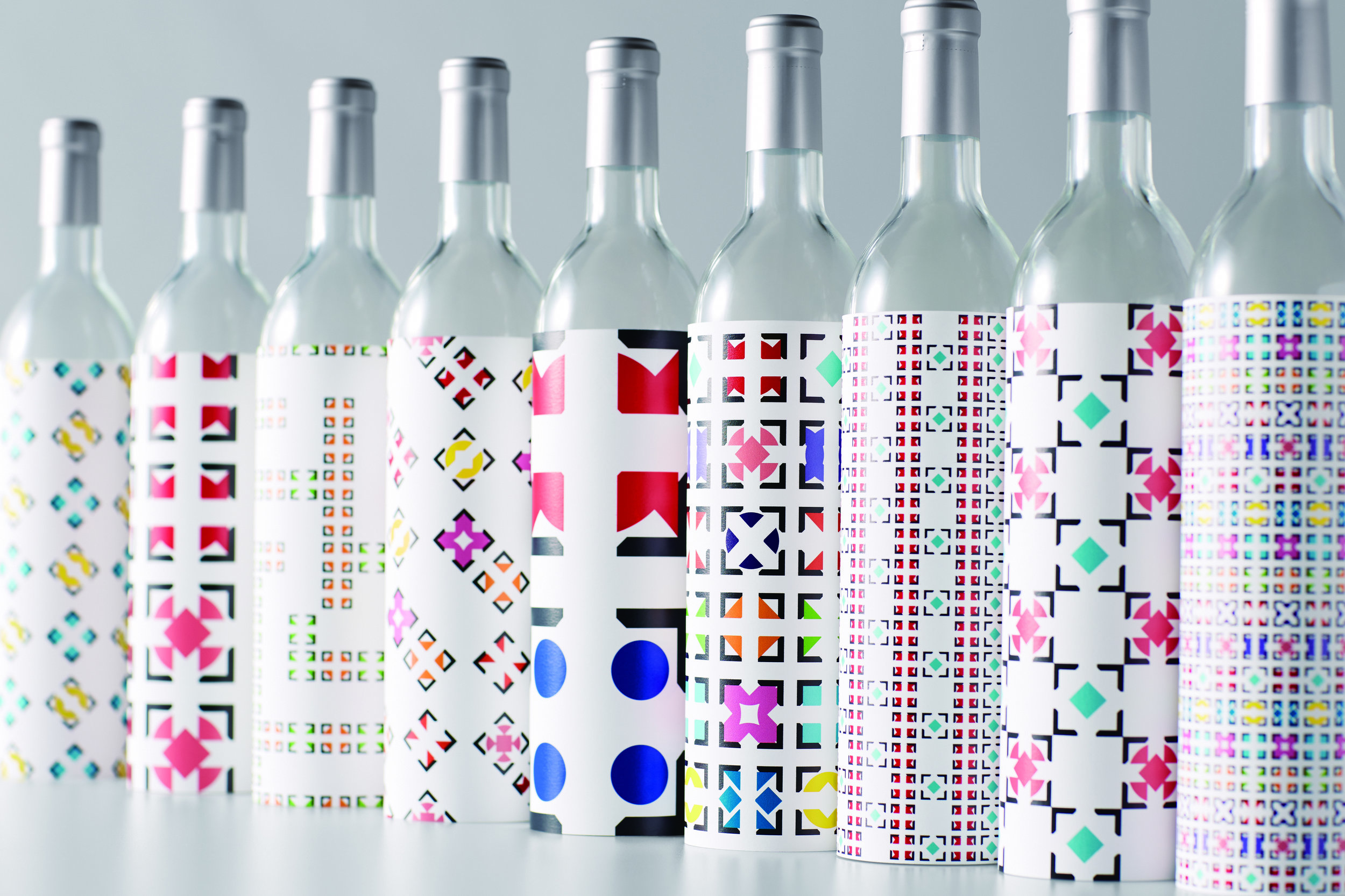
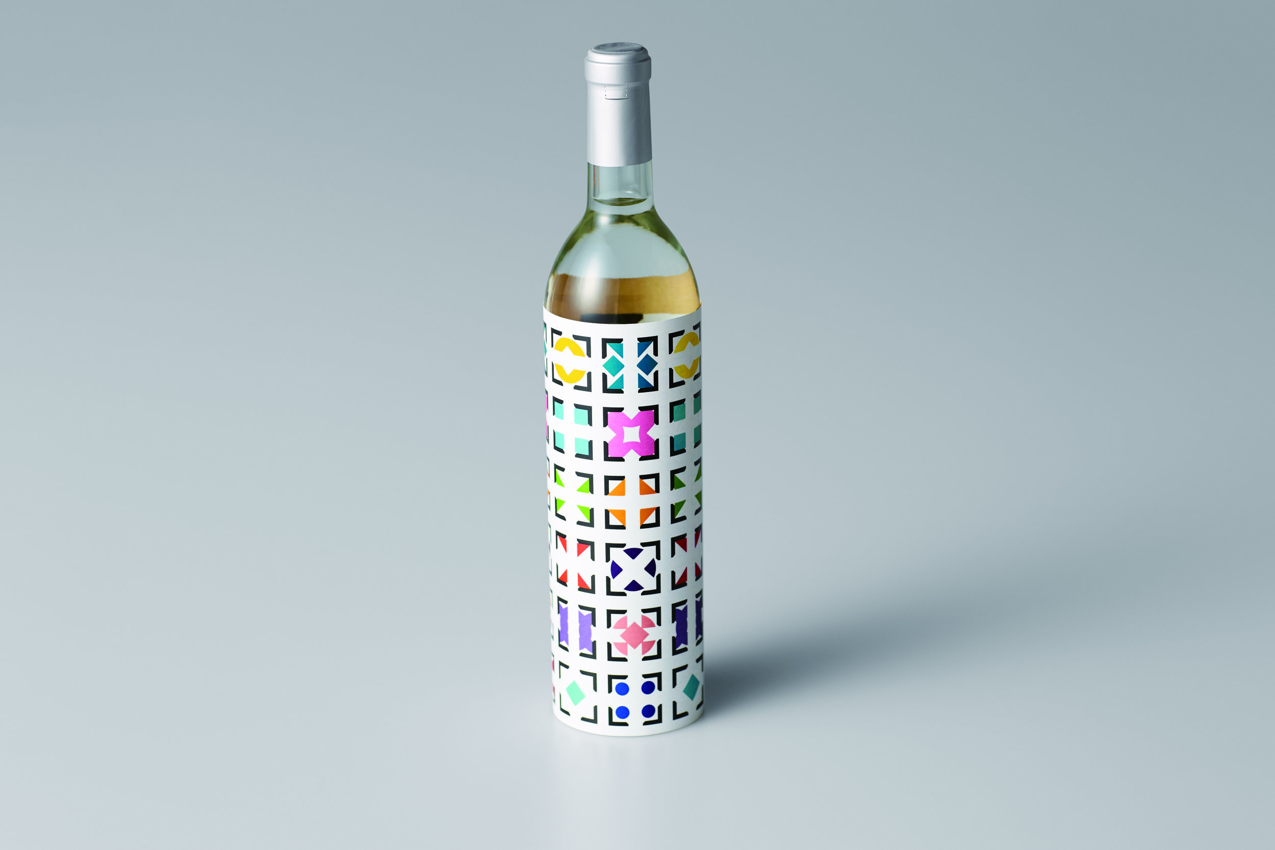
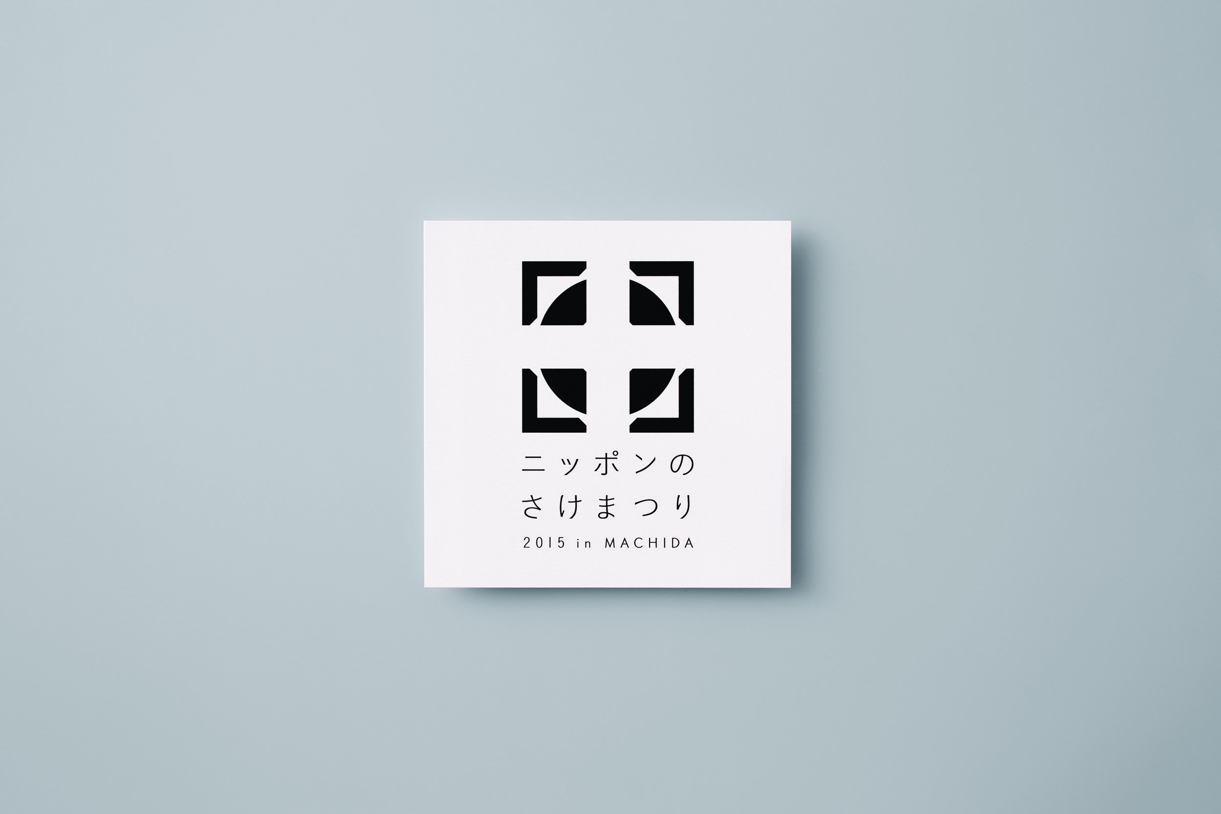
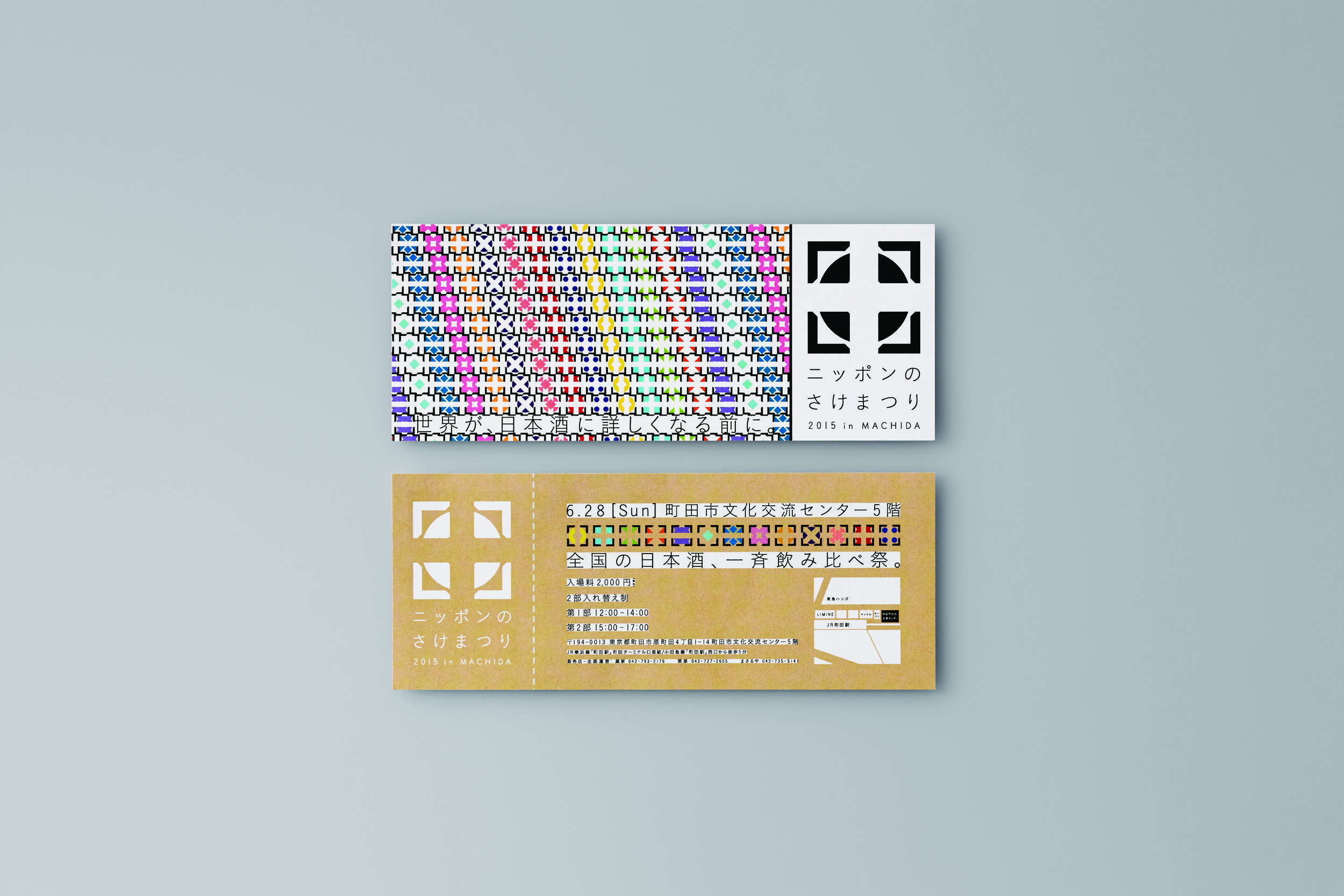
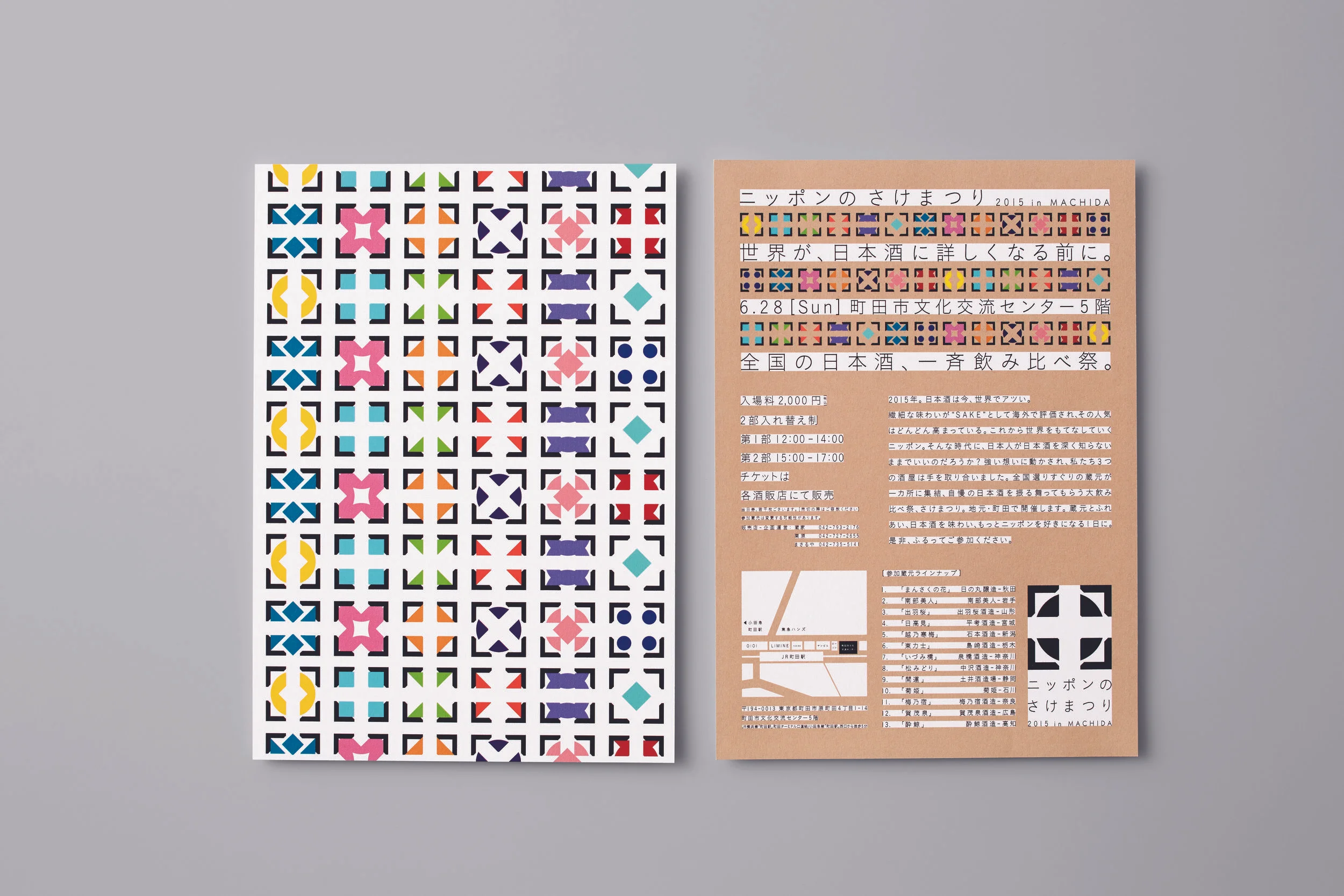
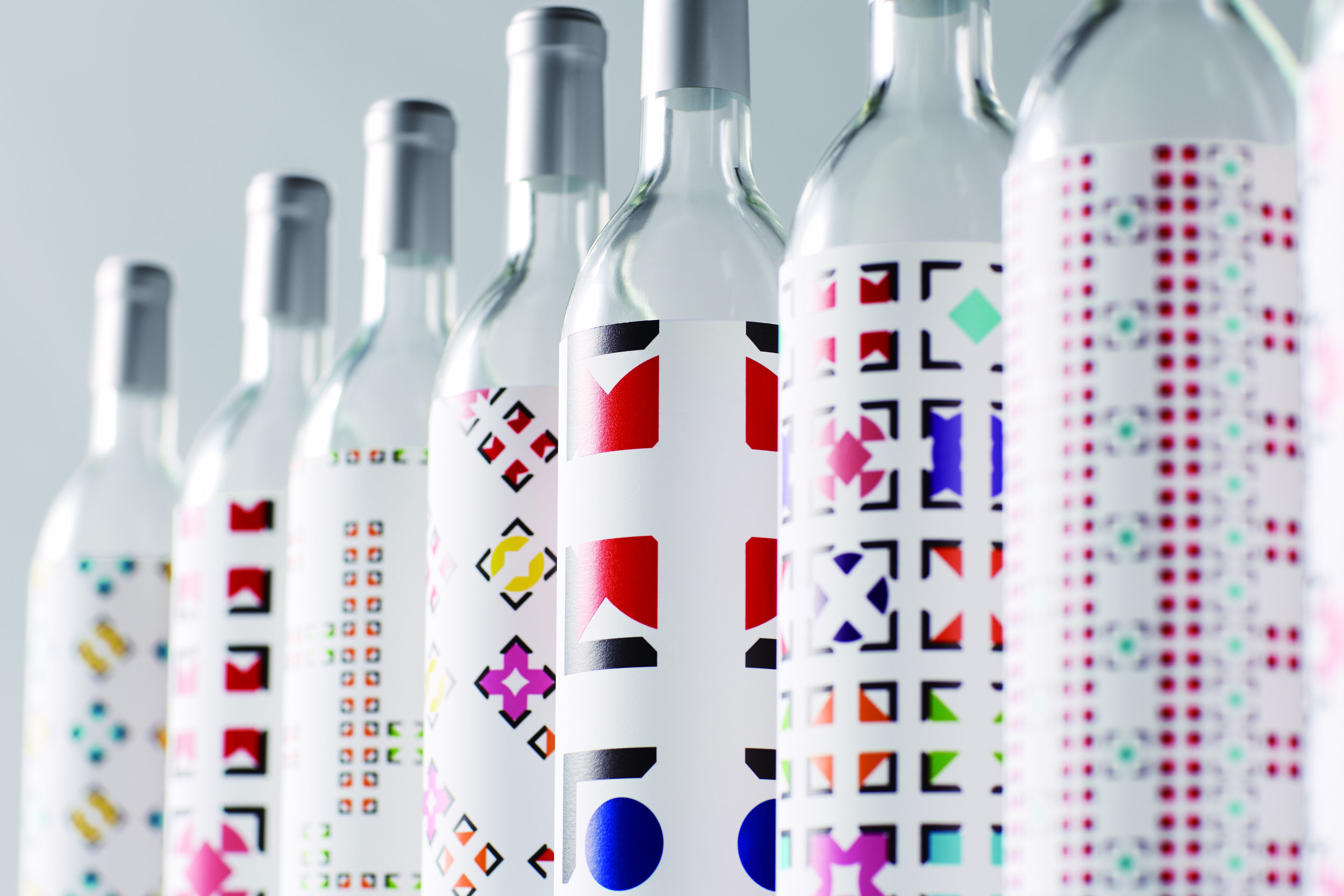
At first sight, all sake appears the same, however there is a big difference in the taste depending on the distillery which is one of the charms of sake. For the event, we designed “the sake crests” inspired by 13 different kinds of sake. Each one unique and set in a black frame, adding a modern twist to the historical Japanese family crest. With this approach, we showed that although all sake is brewed in the traditional style, each one is different.
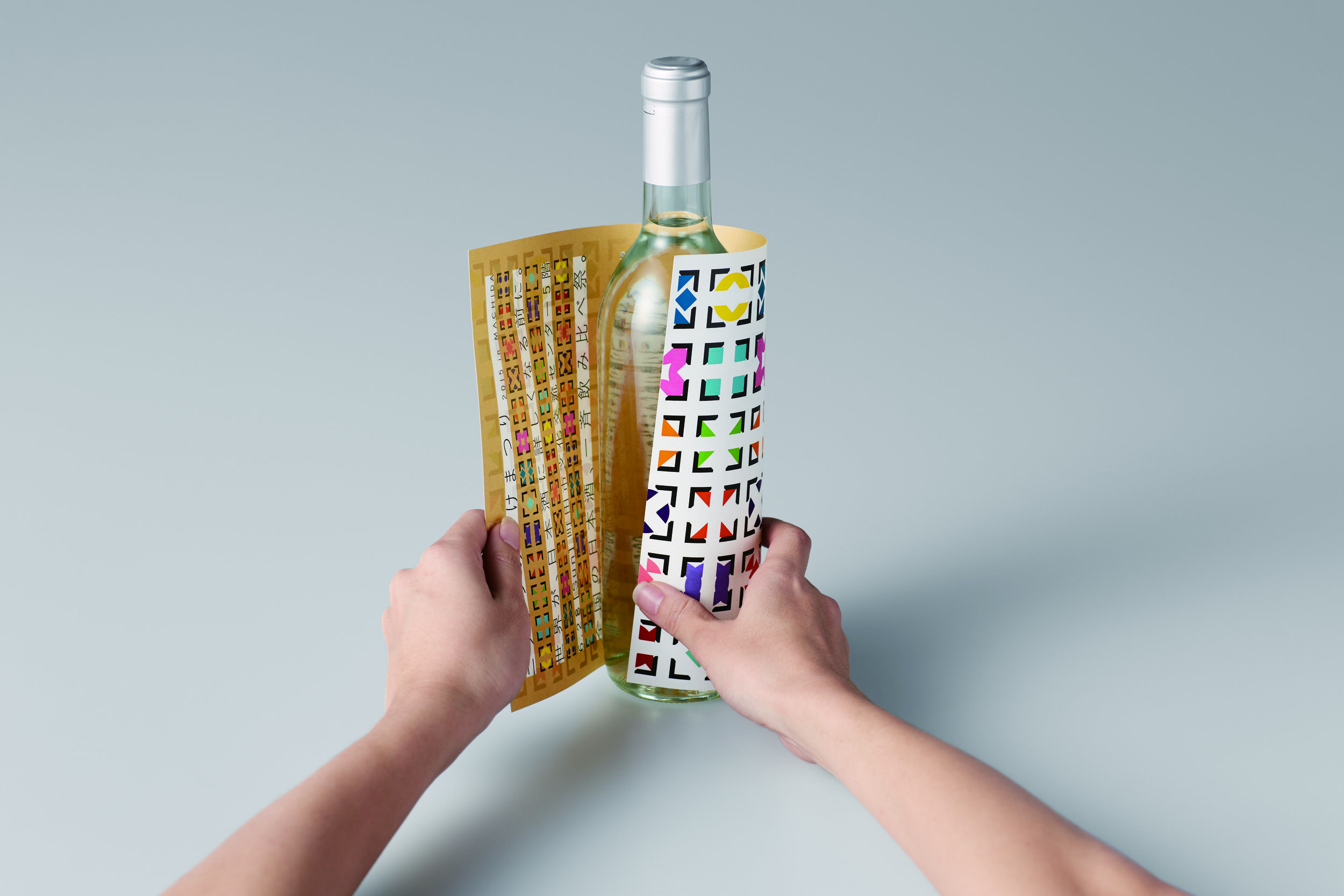
Various patterns were printed on promotional items, posters, flyers, tickets and signs. At the store, we used the flyers as wrapping paper for all liquor bottles bought by consumers.
